


Permalink🎏 Background :

Hi everyone, in this article we are going to touch on general terms which frequently come in grids and some basic properties of CSS grids. So stay tuned for upcoming articles on grids.
Permalink🎏 What is Grid?
Grid is a two-dimensional layout system that, compared to any layout system in past completely changes the way we design user interfaces. Grid gives us a no. of properties to adjust the content on the webpage in a very effective way.
Permalink🎏Basic terms :
- 🚩 Container: The element of the webpage on which the display: grid property is applied. It is the direct parent of all the grid items.
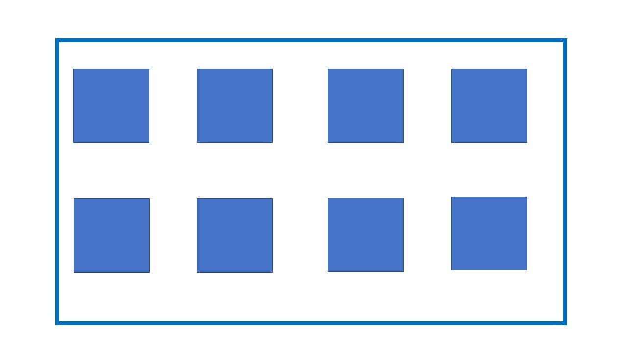
- 🚩Grid items: These are the children or direct descendants of the grid container. Here the elements are grid items but sub-elements are not.
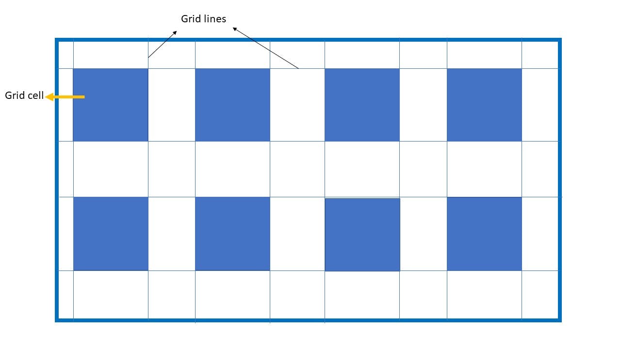
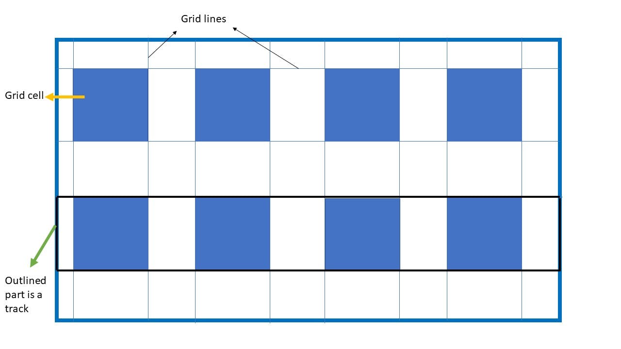
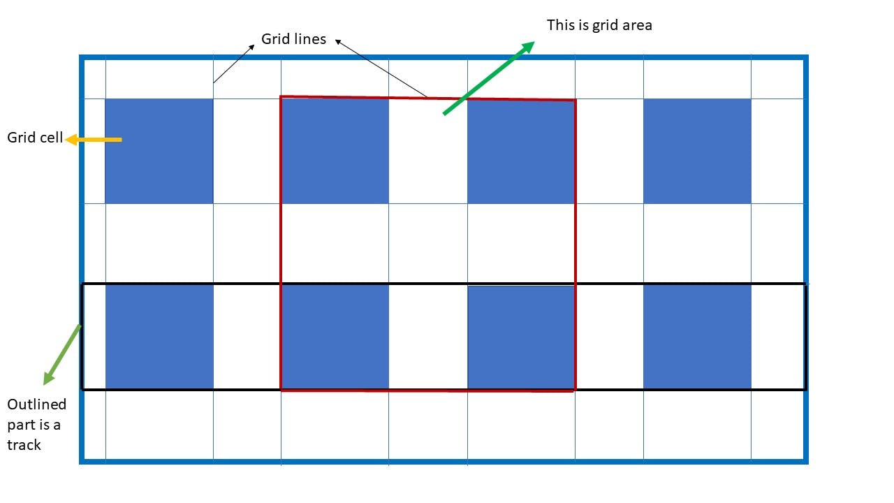
- 🚩Grid line: The dividing lines that make up the structure of the grid. They can be either verticle or horizontal and reside on either side of a row or column.
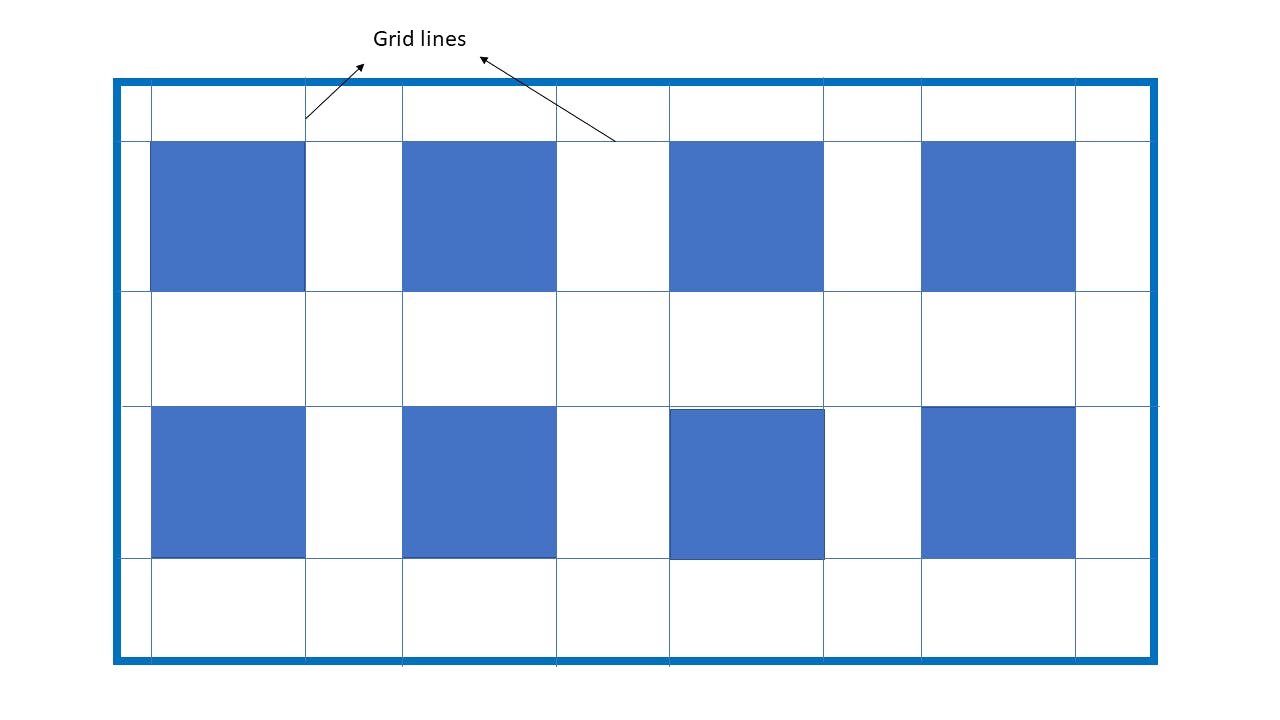
- 🚩Grid cell: The space between two adjacent rows and two adjacent columns grid lines is known as one grid cell. It's the single unit of the grid.
- 🚩Grid track: It can be defined as the space between two adjacent grid lines. You can think of it as a row or column of a grid.
- 🚩Grid area: The grid area can be termed as total space surrounded by four grid lines.
Permalink🎏 Properties in Grid :
Permalink👑 Display :
This property defines an element of the HTML page as a grid container which becomes the parent element for its descendant items.
Permalinksyntax:
.container {
display: grid;
}
Permalink🎟️ grid-template-colums and grid-template-rows :
Generally, our items get arranged in an inline structure. So to arrange them in grid columns and rows we use these two properties.
This will bring columns and rows of a grid with a space-separated list of values.
Permalinksyntax:
.container{
grid-template-columns: _ _ _ ;
grid-template-rows: _ _ _;
}
Example:
- You can run this code on your machine also. If you notice in the CSS file we have repeated the 200px value 5 times. To avoid such repetition you can use the repeat( ) function.
.container{
grid-template-columns: repeat(5, 200px);
}
You just replace this property and will get the same output and the same can apply to grid-template-rows also.
- You can utilise the whole space of the parent container by a combination of the repeat( ) function and fr unit.
Permalink🎟️ grid-template-areas :
This property defines a grid template by referencing the names of the grid areas which are specified with the grid-area property.
Repeating the name of a grid area causes the content to span those grid cells.
Period ( . ) is used in the representation of an empty cell.
Permalinksyntax:
.container {
grid-template-areas:
"<grid-area-name> | . | none|..."  /* here | sign represent logical OR*/
".......";
}
Example:
Permalink🎟️ grid-template :
This property is a shorthand property for setting grid-template-rows, grid-template-columns and grid-template-areas in a single declaration.
Permalinksyntax :
.container {
grid-template:none | <grid-template-rows> / <grid-template-columns> ;
}
Here none sets all values to default.
<grid-template-rows> / <grid-template-columns> : this sets grid-template-rows and grid-template-columns to specified values and grid-template-areas to none .
The syntax feels quite confusing but if we understand by example it will make sense
- In this example first, we write the area name which we have to span and the corresponding row size. On listing all values above give a "/ " symbol as in syntax and mention column size. This will give the same result as the above grid-template-areas.
Permalink🎟️ gap :
As like flexbox grids also have gap property. Since the grid is a two-dimensional layout system hence gap property gets divided into two parts "row-gap" and "column-gap".
Permalinksyntax:
.container {
gap: <row-gap> <column-gap> ;
}
Example:
In the above example, we can see the gap.
The gap can be referred to as a gutter on some sites so don't get confused.
That's all to get started with the grid. I will upload 2 more articles on the grid soon.
Linkedin : https://www.linkedin.com/in/kaushik-gabhane-013708203/
Instagram: instagram.com/kaushikgabhane
THANK YOU😊 !