


🎏 What is Flexbox :
The flexbox is a whole module not a single property. It consist of group of properties. Some of them arer meant to set on flex container ( the parent element ) and some of them on child or flex items.
you can use the same html code to play with different flex-box properties mentioned below
 <div class="container">
        <li class="item" id="one">one</li>
        <li class="item">two</li>
        <li class="item">three</li>
        <li class="item">four</li>
        <li class="item">five</li>
        <li class="item">six</li>
        <li class="item">seven</li>
        <li class="item">eight</li>
        <li class="item">nine</li>
        <li class="item">ten</li>
    </div>
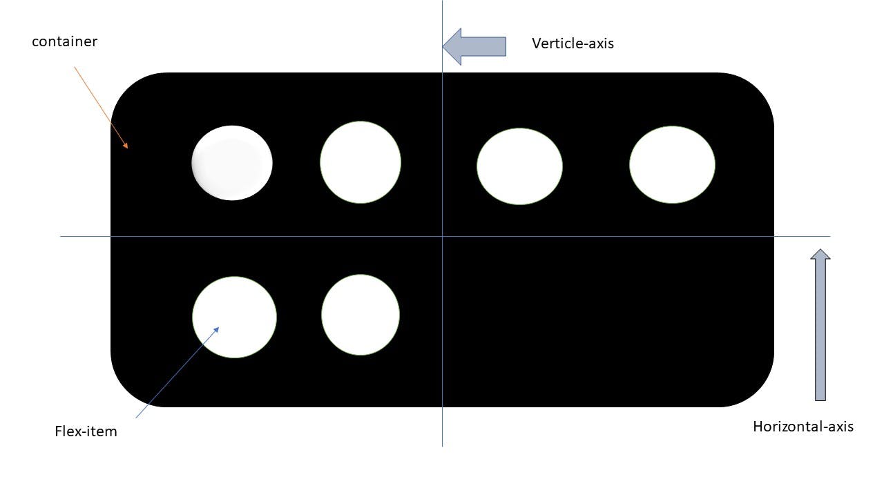
Some of the terms get come again and again so they are mentioned in above figure. So let's get started.
🎏 properties on flex container (parent ) :

🎟️Display :
This property defines a flex container. It may be inline or block depending on given values. It enables flex context for all its direct children.
syntax:
.container {
  display: flex;
}
🎟️Flex-direction :
Flexbox is a single direction layout concept. This establishes the main-axis, thus defining the direction of flex items placed in container.
syntax :
.container {
   flex-direction: row | row-reverse | column | column-reverse;
}
- row : pack items from left to right.
- row-reverse : pack items from right to left.
- column : same as row but top to bottom.
- column-reverse : same as row-reverse but bottom to top.
🎟️Flex-wrap :
By default the flex items try to fit onto one line. We can change that and can allow items to wrap as needed.
syntax :
.container {
    flex-wrap: nowrap | wrap | wrap-reverse;      /*nowrap is default one*/
}
- wrap : with this property flex items tend to wrap on multiple lines from top to bottom.
- wrap-reverse : just opposite from wrap. items tend to wrap from bottom to top.
🎟️Flex-flow :
This is a short-hand property for flex-direction and flex-flow properties. The default value is row wrap. We can change it as ,
syntax :
.container {
   flex-flow: column wrap;
}

🎟️justify-content :
This defines alignment of items along row direction ( horizontal direction) in that line. It helps in distribution of extra free space lef over either all the flex items on a line or inflexible or are flexible but have reached maximum size. It also exerts some control over the alignment of the items when they overflow the line.
syntax :
.container {
    justify-content: flex-start | flex-end | start | end | center | space-between | space-around | space-evenly;
}
- flex-start : items aligned from start of flex direction.
- flex-end : items are aligned towards end of flex-direction.
- start : items are aligned from the start of writting mode direction i.e. left to right.
- end : end of writting mode direction.
- center : items are centered along the line.
- space-between : items are evenly distributed in thee line with space between each items.
- space-around : items are evenly distributed in the line with equal amount of space on both the sides of item.
- space-evenly : items are evenly distributed so that space between two items and with edge of line is equal.
🎟️Align-items :
This defines the default behaviour for how flex items are laid out along the verticle axis of current line.
syntax :
.container {
    aign-items: stretch | flex-start | flex-end | start | end | center | baseline | last-baseline | self-start;
}
- stretch : this property is used to fill container ( still works within min-width & max-width ).
- flex-start /start / self-start : items are placed at the start of the line. the difference between these is subtle and are about to respecting flex-direction and writting mode direction rules.
- flex-end / end / self-end : items are placed at the end of horizontal axis.the difference is again subtle and follows flex-direction and writting mode direction rules.
- center : items are centered in the horizontal axis .
- baseline : items are aligned such as their baseline align .
🎟️Align-content :
This aligns flex container's lines within the container when there is extra space in the verticle axis. It's quite similar to justify content in horizontal axis. This property only takes effect on multi-line flexible containers, where flex-wrap is set to wrap or wrap-reverse.
syntax :
.container {
    align-content: flex-start | start | flex-end | end | center | space-between | space-around | space-evenly | stretch | baseline | first-baseline | last-baseline ;
}
🎟️ gap , row-gap , column-gap :
The gap property explicitely controls the gap between flex items but not at the edges. The gap property only be in effect that the space between two flex items is smaller than the gap property.
syntax :
.container {
    gap : 10px ;
}
This property works in flex-box , grid and multi-line columns also.
🎏properties on flex items ( children ) :

🎟️Order :
By default flex items are laid down in the source order. However the order property controls the order in which they appear in the flex container . Items with same order revert to source order .
syntax :
.item {
    order : 5 ;    /*default is zero */
}
🎟️Flex-grow :
this ability defines a flex item to grow if necessary. It accepts a unitless value that serves as a proportion. The number indicates what amount of space inside the container the item should take up.
syntax :
.item {
    flex-grow: 4 ;
}
🎟️ Flex-shrink :
This defines the ability for a flex item to shrink if necessary.
syntax :
.item {
    flex-shrink: 3 ;
}
🎟️Flex :
This is a short hand for flex-grow , flex-shink and flex-basis combined. The default value is 0 1 auto.
syntax :
.item {
    flex : 5 ;
}
/* if we are setting flex : 5 so its like setting flex-grow : 5;  ,  flex-shrink : 1 ;  ,  flex-basis: 0% ;  */
Thank you
linkedin : linkedin.com/in/kaushik-gabhane-013708203 instagram : instagram.com/kaushikgabhane?r=nametag